NewGeography.com blogs
by Anonymous 03/01/2011
Isn't it curious that an Administration devoted to the principle of multi-modalism is so obsessively determined to promote a single mode of its own preference -- that of high-speed rail? All three governors who rejected the federal HSR grants --- Govs. Walker, Kasich and Scott --- told Sec. LaHood that their states could badly use that money for more urgent needs of fixing roads, bridges and transit systems and, in the case of Gov. Scott, rebuilding Florida's ports in anticipation of the Panama Canal expansion.
Yet Sec. LaHood turned a deaf ear to those requests, insisting that the stimulus money must be spent on high-speed rail --- even though money spent on other modes could have been just as effective in creating jobs. After justly condemning "stove pipe" mentality and modal biases in federal decision making it is ironic to find the Administration ignoring its own principles of modal neutrality in such a blatant manner.
Census data released in the last week indicates confirms the continuing dispersion of population away from the historical core municipalities (central cities) to the suburbs in the 2000 to 2010 decade. The new figures, for Las Vegas, Birmingham and Salt Lake City indicate that a majority of growth occurred in the suburbs in each metropolitan area and that the dispersion of population to the suburbs was greater in the 2000s in each case than in the 1990s.
Las Vegas: The Las Vegas metropolitan area continued to grow strongly, adding 41 percent to its population between 2000 and 2010. This, however, represents a more than halving of the growth rate from the 1990s (86 percent). The metropolitan area population in 2010 was 1,951,000, up from 1,376,000 in 2000.
The core municipality of Las Vegas of grew 22 percent between 2000 and 2010 (from 478,000 to 584,000). The core city of Las Vegas has an overwhelming suburban urban form, having experienced virtually all of its growth in the modern, car oriented era of suburbanization. During the 2000s, the land area of Las Vegas was expanded from 113 square miles to 131.
The suburbs grew 52 percent between 2000 and 2010. The suburbs attracted 82 percent of the metropolitan population growth, up from 65 percent in the 1990s. The suburbs now account for 70 percent of the Las Vegas metropolitan area population.
Birmingham: The Birmingham metropolitan area experienced a decline in growth rate from 10 percent in the 1990s to seven percent in the 2000s. The population increased from 1,052,000 to 1,128,000.
The historical core municipality of Birmingham declined eight percent, from 243,000 to 212,000. This loss of 13 percent is the largest yet recorded for a historical core municipality in a major metropolitan area. Birmingham’s population peaked at 341,000 in 1960. This loss of more than one-third in population between 1960 and 2010 is despite annexations that doubled the size of the city (from 75 to 150 square miles).
The suburbs gained 13 percent between 2000 and 2010 and captured 140 percent of the metropolitan area’s growth (up from 124 percent in the 1990s). The suburbs now account for 81 percent of the metropolitan population.
Salt Lake City: In the Salt Lake City metropolitan area growth declined to 16 percent in the 2000s from 26 percent in the 1990s. The population rose from 969,000 to 1,124,000.
The historical core municipality of Salt Lake City grew three percent (from 182,000 to 186,000). Salt Lake City reached its population peak at 189,000 in 1960. This modest loss occurred while the land area of the city nearly doubled (from 56 square miles to 109).
The suburbs gained 19 percent between 2000 and 2010. The suburbs attracted 97 percent of the metropolitan population growth, which is up from 89 percent in the 1990s.
According to just-released 2010 Census results, the city of St. Louis experienced an unexpected loss in population from 348,000 in 2000 to 319,000 in 2010. This was surprising since the latest population estimate was 357,000 (2009). The new population figure however provided exoneration for the Census Bureau, which had been challenged six separate times during the decade on its city of St. Louis population estimates. The higher 2009 population estimate was the cumulative effect of those six successful challenges. In fact however, without the challenges the city of St. Louis population would have been 311,000, much closer to the final count of 319,000 people.
Among the world's municipalities that have ever achieved 500,000 population non-have lost so much as the city of St. Louis. The new figure of 319,000 people is 63 percent below the 1950 Census peak of 857,000 people. Indeed, the 2010 population is nearly as low as the population in the 1870 census.
Even so, the population loss of the last decade belies the progress that has been made in converting warehouse buildings, office buildings and other disused structures into urban residential areas, especially along Washington Avenue. These developments, among the largest in the United States, however, fell far short of preventing the population loss.
The St. Louis Metropolitan area did much better. In 2010, the metropolitan area had a population of 2,813,000, up from 2,699,000 in 2000, a gain of four percent. The loss in the city was eight percent, while the suburbs gained six percent.
Hong Kong financial chief John Tsang has promised to expand the city's land supply for residential housing, "in response to rising public anger over soaring property prices and repeated warnings of a looming real estate bubble." Channel News Asia's Hong Kong bureau indicated that the move was precipitated by the "sky-high" housing cost that have been drive by insufficient land for development and speculation (which routinely is intensified where demand for housing is permitted to outstrip supply.
Buggle Lau, chief analyst at property firm Midland Holdings told Channel News Asia that he supported the expansion of the land supply "as a way to bring down house prices," adding "It's simple economics - lower demand and higher supply will bring prices down." Channel News Asia noted that Hong Kong had been shown to be the most unaffordable metropolitan market in the recent (7th Annual) Demographia International Housing Affordability Survey.
The Bureau of Economic Analysis yesterday released the 2009 data for metropolitan area GDP. Their headline, “Economic Decline Widespread in 2009,” should come as a surprise to no one.
The BEA focuses on the year on year change. I’d rather look at the full span of the data that’s available, which is now 2001-2009. Here’s a look at percent change in total real metro area GDP during that time period:
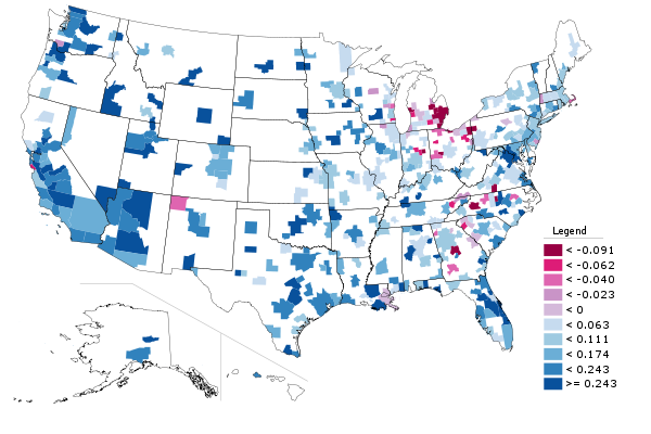
And here are the top ten metro areas over one million in population on this metric:
| Row |
Metro |
2001 |
2009 |
Pct Change |
| 1 |
Portland-Vancouver-Hillsboro, OR-WA |
81,505 |
114,028 |
39.90% |
| 2 |
Oklahoma City, OK |
43,835 |
59,532 |
35.81% |
| 3 |
Austin-Round Rock-San Marcos, TX |
55,466 |
75,136 |
35.46% |
| 4 |
Las Vegas-Paradise, NV |
63,730 |
82,255 |
29.07% |
| 5 |
Orlando-Kissimmee-Sanford, FL |
71,940 |
91,400 |
27.05% |
| 6 |
Phoenix-Mesa-Glendale, AZ |
138,780 |
174,617 |
25.82% |
| 7 |
Washington-Arlington-Alexandria, DC-VA-MD-WV |
294,656 |
368,793 |
25.16% |
| 8 |
San Jose-Sunnyvale-Santa Clara, CA |
117,447 |
146,448 |
24.69% |
| 9 |
Salt Lake City, UT |
48,157 |
59,603 |
23.77% |
| 10 |
San Diego-Carlsbad-San Marcos, CA |
126,875 |
155,850 |
22.84% |
Per capita tells is a little bit different story. Here’s a map of US metro areas for percent change in real GDP per capita:
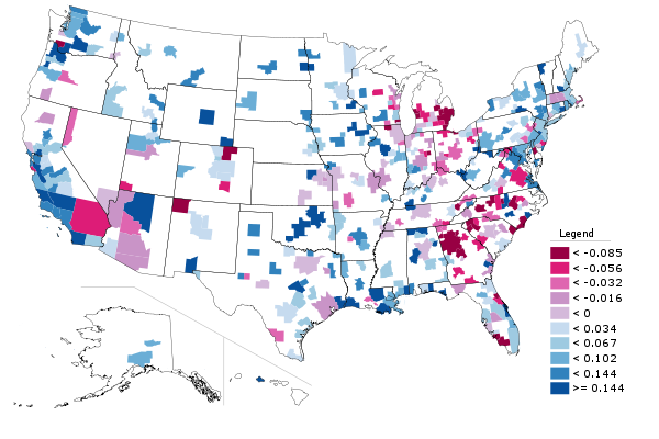
The stunning collapse in real per capita GDP and also the erosion in per capita personal income relative to the nation is one of the key reasons I see Atlanta as a region with far more troubles than is generally assumed.
Here are the top ten large metros again:
| Row |
Metro |
2001 |
2009 |
Pct Change |
| 1 |
Portland-Vancouver-Hillsboro, OR-WA |
41,256 |
50,863 |
23.29% |
| 2 |
Oklahoma City, OK |
39,573 |
48,507 |
22.58% |
| 3 |
San Jose-Sunnyvale-Santa Clara, CA |
67,299 |
79,604 |
18.28% |
| 4 |
San Diego-Carlsbad-San Marcos, CA |
44,252 |
51,035 |
15.33% |
| 5 |
San Francisco-Oakland-Fremont, CA |
63,260 |
72,259 |
14.23% |
| 6 |
Los Angeles-Long Beach-Santa Ana, CA |
46,147 |
52,158 |
13.03% |
| 7 |
Washington-Arlington-Alexandria, DC-VA-MD-WV |
59,801 |
67,344 |
12.61% |
| 8 |
Virginia Beach-Norfolk-Newport News, VA-NC |
37,960 |
42,521 |
12.02% |
| 9 |
Buffalo-Niagara Falls, NY |
31,160 |
34,472 |
10.63% |
| 10 |
New Orleans-Metairie-Kenner, LA |
49,100 |
53,835 |
9.64% |
All I can say is, this data looks great for Portland. That city isn’t perfect to be sure, but on the GDP side of the house, the plan is working beautifully. Contrary to slacker stereotypes, high value work is increasingly being produced there.
Aaron M. Renn is an independent writer on urban affairs based in the Midwest. His writings appear at The Urbanophile.
|