In 1998 Hollywood introduced us to a new star when it released The Truman Show, shot on location at Seaside in Florida. No I’m not talking about Jim Carrey, Laura Linney or Ed Harris. I'm talking about none other than Andres Duany.
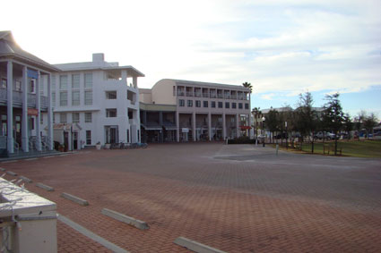
A few months ago, I stayed at the magnificent WaterColor Inn, which is in the neighborhood adjacent to Seaside. Watercolor is closer in feel to a suburban development's sense of space (more open), but WaterColor’s Town Center doesn't offer a large choice of restaurants, so Seaside serves as a destination. Other than a sign marking the border, one does not immediately feel as if Seaside and WaterColor are two very different developments.
While both Duany and Peter Calthorpe seem to make claims to be the founders of the New Urbanism, Duany gets more attention. I’ve only met him once, at a conference. I was impressed with his presentation as honest and straightforward, even though I’m not a New Urbanist — quite the opposite, in fact. He spoke of his disdain for the suburbs, but agreed that 80% of the housing market preferred them, and then went on to speak of the benefits of New Urbanism.
 What I experienced in Seaside was much different than what I expected from watching The Truman Show. When the film was released, the main feature of a typical cookie-cutter suburban home was… well, uh, hmm… I guess you could describe it as quite featureless. But some developers and builders ventured forth into New Urbanism, or an emulation of the look. The home buyer was now faced with a choice: the requisite aluminum, white, three car garage door with the home hidden somewhere behind it, or a home with a front porch instead. Buyers became smitten. They may have still bought the garage snout home, but the writing was on the wall. The days of the vinyl clad / garage forward / featureless home were numbered, and if builders were smart, then they had to increase their architectural character. Many suburban homes gained a porch, some architectural detail, and a somewhat less prominent garage. Buyers started demanding walks and other amenities… and builders and developers responded until the housing market crashed.
This evolution can be attributed more to the efforts of Duany than of anyone else. The Duany developments stand apart from some other New Urbanist development partly because of their detail and character, and partly because of their high price point. I’ve been to the Kentlands, I’on, Celebration, and now Seaside. The architectural and landscape detailing is outstanding. When I went to Kentlands, a decade ago, I got lost; it breaks from the Smart Growth grid theory. There was nobody sitting on the porches, and I saw only one person walking. To be fair it was during the workday. I was really looking forward to a stroll to the local coffee shop, but instead, the K-Mart strip center defined the entrance with no apparent internal commercial development. I understand that today there are more walkable services.
On my I’on visit (on a nice weekend) I saw very large homes with only single car garages or no garages at all. Again, nobody was sitting on any of the porches (which were spacious and beautiful), but there were people strolling. I’on is a very large development, and the only one I visited that seemed to be planned on a grid. The only local businesses (at the time) were a chocolate shop, a hair stylist, and the I’on sales office. For anything else you would probably need to drive.
Upon entering Celebration we were greeted by massive, majestic homes that align the main street. Very cool. This gives a feeling of arrival, as opposed to a suburban development that would typically showcase the highest density and cheapest product at the front entrance (blame Levittown transitional zoning for that). On a Sunday morning my wife and I had a coffee in the Celebration town center. We were alone, other than one other table where a real estate salesman was trying to sell one of the homes. The stores were open, but either people aren't shopping before 11:00AM on Sunday mornings, or they simply get tired of frequenting that same shop that sells all items with “Celebration" logos. Again, not a soul on the front porches, and only a few on the walks.
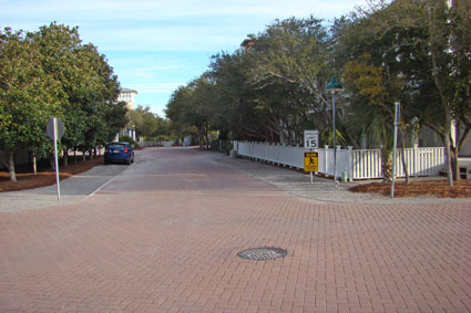
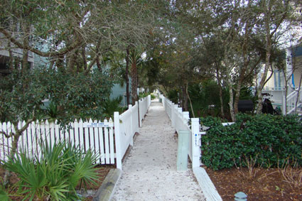
 I distinctly remember Seaside from The Truman Show as well coiffed and manicured. Homes all behind picket fences. When we strolled the streets, the landscaping between each home and white picket fence was overgrown, making it difficult to see the homes and closing up space along the streets. There were no walks along the streets. There were natural trails in a straight pedestrian system behind each home along the rear yards, with paths so narrow (about 4’ between picket fences) that I needed to follow behind my wife as we strolled through the blocks (these paths were not in the movie).

Many of the homes had observation towers hovering over the rooftops, cool architectural features that would allow a view of the shoreline. A decade after the development's premiere, that open view was closed up by a wall of very large ocean view homes, blocking all those great views that the towers would have provided. There's now little tie from the community to the shore other than a single bar elevated above the shops allowing a good view.
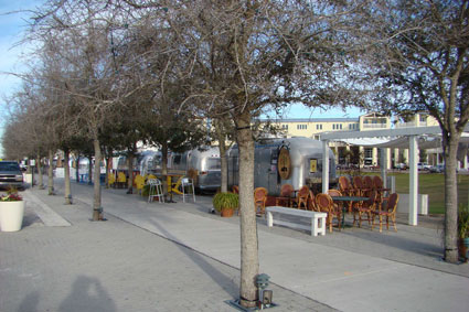
 In general, much of Seaside is overgrown with landscape that blocks the feeling of space. We were told by a few sources that only about twenty residences have full time owners, with the rest rented. There were a few restaurants and bars, and the same grocery store that was in The Truman Show, but the feel of the development was much different than what I expected after seeing the movie. The main street has rows of Airstream trailers with street vendors selling various food items, something I found distracting from the image of New Urbansim; very touristy. The general pattern of Seaside is quite maze-like, requiring us to carry a map as we took a stroll.
By contrast, WaterColor has similar architectural character, but is much more diverse in its open spaces and provides the look of Seaside with a more suburban sense of space. Seaside homes generally lacked vehicle storage or protection from the elements; WaterColor homes had the convenience of garages -- mostly, but not all, in alleys -- and some carports. Garages are an indication of permanent residence, not a weekend jaunt. They keep many of the cars off the street and out of sight. Unlike a standard New Urbanism design that separates the garage from the home (as if a car contained some negative aura that could take control of our lives), the WaterColor homes had the garages attached. WaterColor is a place you can live in, not just rent for a week.
If the nation's suburban architectural character has improved, I think much of it is due to the effort that Duany has taken to showcase New Urbanism, which has had a positive influence in the overall character of land development. Whether New Urbanism thrives or it fails, he has left us this lasting gift. Duany developments I’ve visited are beautiful, even with their flaws and their high priced entry.
But architecture and landscaping are NOT planning. And here lies the problem. You can take the worst planned neighborhood and showcase it with the Duany style of high quality elements —- his eye for architecture and landscaping —- and it will look great. In a well-planned suburban neighborhood, on the other hand, the display of repetitive garage-grove facades with plain vinyl siding, void of landscaping other than the requisite sod, will look awful. As people drive or stroll through the Duany development, they will naturally say it’s well planned, even if it’s dysfunctional, inefficient, and has a high environmental impact. This is not to say that it necessarily is, but you can’t feel those things from street level. The plain subdivision will be identified as terribly planned, even if the plan is functional and efficient with low environmental impacts.
I’m not a follower of Duany and disagree with much of his ideology. But I do thank him for making the real world, suburban and urban —- not just the make-believe world of The Truman Show —- a better place.
Rick Harrison is President of Rick Harrison Site Design Studio and Neighborhood Innovations, LLC. He is author of Prefurbia: Reinventing The Suburbs From Disdainable To Sustainable and creator of Performance Planning System. His websites are rhsdplanning.com and performanceplanningsystem.com.
Photo: Seaside, Florida's Post Office -- Where they filmed 'The Truman Show'


They provide various offers
They provide various offers from which you can select the best suited package for your organization. click to find out more
I could never ever believe a
I could never ever believe a SEO Web page website hosting support assistance support assistance solutions giving endless information return amount useage or storage space, unless one is actual a large area of quantity regarding forex trading.
SEO Greater will increase
SEO Greater will increase your web popularity, your website hits and your sales. Go Here
This makes considerable
This makes considerable value in the mind of the world wide web client.
If you need some help with your online promotion then you can always go to check your local collection and get some excellent guides on promotion. Insidious Chapter 3
Look on the bright side
"But architecture and landscaping are NOT planning" They actually are, because they are the constituent parts. Everything built in the USA is planned, the question is wether it's done well or not. You don't need to be a new urbanist to appreciate urbanism. Duany's genius was not to attack the suburbs per say, it was in identifying all the things that keep the suburbs from being more humane and livable. Now I wish he'd focus some of his brilliance on how to up-end the modernists' dominance of architecture school the same way he's upending the dominance of car-oriented planning.
Architecture and Planning is not necessarily "planned"
Decades ago, when a developer client came to us to plan their suburban subdivision - they thought in terms of selling lots to builders - there was no "planning" of architecture nor any thought as to a landscaping theme, often left to the builders requirement to sod the front yard, and perhaps a street tree if forced by local regulations. If a builder was financed by the local lumber yard, architecure was usually a selection of a plan more designed on how to package the materials to sell to that local builder than living quality or a "planned" design. When we evolved our planning business in the late 1990's to demand architectural and landscaping elements (awareness) from the developer or we would not take on the job, we lost some of those clients. There is certainly no shortage of firms that would welcome the income and not hold these developers to any standard. There are parts of the country where even the lowest cost development has a high degree of architectural and landscaping character, and other regions that are void of them. An interesting exercize is to get on a Major Home Builders (one of the nationals) web sites and look at the varying regions of the country they serve. Look at three things - the home size, architectural character, and the price points. Try to seek a common ground, such as look for a 2,500 sq.ft. home. You are likely to see a great variety in the architectural character of the homes depending upon what region of the country you are looking at. In some areas you will see a high degree of character without necessarily being higher priced... it's an interesting exercize.
Anyhow I diverted my original point - that unfortunately many developers still subdivide land with no thought as to controlling architecture and landscaping - and that is not planning, but a void of planning.
ok
Your point is well taken, but I'm not sure it helps in bringing in the bottom feeders if we self segregate between people who get "planning" and people who don't.
I think it helps...
When we stopped working for those "bottom feeders" and told them to go elsewhere, most asked why. We explained that to add walks creates value that the consumers would pay for, to create an architectural theme would prevent some hideous home being built that could destroy future lot sales, a landscape theme creates consistency and reduces that possible junkyard look that can hurt their bottom line. They listened - it registered - they changed...
We found that most developers were not bottom feeders as much as simply following what the others have done, which by the way is eactly what the inferior suburban ordinances tell them to build! In all, with about 100 developer clients we served back then, I can honestly say only two did not turn around! Being a "bottom feeder" was not intentional - it was just "not knowing" (a kinder use of the word ignorant).
Unfortunately - too many consultants - do not actually "consult" they instead do what ever the developer or builder client says then draws it for construction. This is like going to the doctor and asking for pain medicine to solve your severe chest pains, and that doctor giving you the pills instead of "consulting" with you, investigating, and curing.
Your article had provided me with another point of view on this
Your article had provided me with another point of view on this topic. I had no strategy that things will most likely work on this form as well. Thank you for sharing your opinion obat tbc paru.
Good job!
"many developers still subdivide land with no thought"
"I can honestly say only two did not turn around"
I guess I misunderstood your point.
I'm glad to hear you didn't take too haughty of an attitude. I found many times both architect and developer trying to talk over eachother. You seem to have figured out the language of any buisnessman is green. I wish some of that thinking would trickle down to schools, so young architects wouldn't be so dissapointed.