The nation’s worst-managed transit systems lose 65 cents for every dollar they spend on operating costs, fill only 42 percent of their seats, carry the average urban resident just 40 round trips per year, use more energy and spew out more greenhouse gases per passenger mile than the average car, carry fewer than 14 percent of low-income workers to work, and lost 4 percent of their customers in the last four years.
Oops — excuse me. Those are the numbers for the nation’s five best transit systems outside of New York (which is in a class by itself). The five worst systems, out of the nation’s fifty largest urban areas, lose 87 cents for every dollar they spend on operating costs, fill under 18 percent of their seats, carry the average urban resident less than four round trips per year, use more energy and spew out more greenhouse gases per passenger mile than the average Chevy Suburban, carry less than 2 percent of low-income workers to work, and lost more than 13 percent of their customers in the last four years.
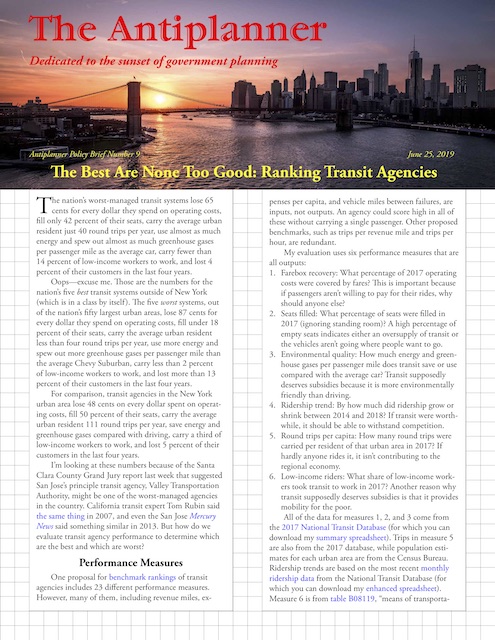
Click image to download a PDF of this policy brief.
For comparison, transit agencies in the New York urban area lose 48 cents on every dollar spent on operating costs, fill 50 percent of their seats, carry the average urban resident 111 round trips per year, save energy and greenhouse gases compared with driving, carry a third of low-income workers to work, and lost 5 percent of their customers in the last four years.
I’m looking at these numbers because of the Santa Clara County Grand Jury report last week that suggested San Jose’s principal transit agency, Valley Transportation Authority, might be one of the worst-managed agencies in the country. California transit expert Tom Rubin said the same thing in 2007, and even the San Jose Mercury News said something similar in 2013. But how do we evaluate transit agency performance to determine which are the best and which are worst?
Performance Measures
One proposal for benchmark rankings of transit agencies includes 23 different performance measures. However, many of them, including revenue miles, expenses per capita, and vehicle miles between failures, are inputs, not outputs. An agency could score high in all of these without carrying a single passenger. Other proposed benchmarks, such as trips per revenue mile and trips per hour, are redundant.
For my evaluation, I’m using six performance measures that are all outputs:
1. Farebox recovery: What percentage of 2017 operating costs were covered by fares? This is important because if passengers aren’t willing to pay for their rides, why should anyone else?
2. Seats filled: What percentage of seats were filled in 2017 (ignoring standing room)? A high percentage of empty seats indicates either an oversupply of transit or the vehicles aren’t going where people want to go.
3. Environmental quality: How much energy and greenhouse gases per passenger mile does transit save or use compared with the average car? Transit supposedly deserves subsidies because it is more environmentally friendly than driving.
4. Ridership trend: By how much did ridership grow or shrink between 2014 and 2018? If transit were worthwhile, it should be able to withstand competition.
5. Round trips per capita: How many round trips were carried per resident of that urban area in 2017? If hardly anyone rides it, it isn’t contributing to the regional economy.
6. Low-income riders: What share of low-income workers took transit to work in 2017? Another reason why transit supposedly deserves subsidies is that it provides mobility for the poor.
All of the data for measures 1, 2, and 3 come from the 2017 National Transit Database (for which you can download my summary spreadsheet). Trips in measure 5 are also from the 2017 database, while population estimates for each urban area are from the Census Bureau. Ridership trends are based on the most recent monthly ridership data from the National Transit Database (for which you can download my enhanced spreadsheet). Measure 6 is from table B08119, “means of transportation to work by earnings,” of the 2017 American Community Survey, and for this measure I define “low-income” as earning under $25,000 a year.
Some urban areas, such as Denver, have only one transit agency, while others have many. The last two measures — round-trips per capita and low-income commuting — don’t work well for individual agencies in regions that have multiple transit agencies, so initially I’m going to look at transit systems, meaning all of the agencies within each urban area.
The best transit systems, in my mind, would collect more in fares than they spent in operating costs, leaving some left over for capital replacement and debt service. They would fill at least 50 percent of seats; 100 percent is not possible for a system whose loads increase as it approaches downtowns and other major job centers. They would carry at least 150 roundtrips per person per year, which is what the average transit system in America did a century ago. Their ridership would grow by at least the rate of population growth; they would use less energy and emit less greenhouse gases per passenger mile than the average car; and they would carry a large percent of low-income employees to work.
Most of these measures are expressed as a percentage where bigger is better. To put the environmental measures on the same basis, I calculated them by dividing BTUs and grams into those of the average car — 2,939 BTUs and 209 grams of carbon dioxide-equivalent per passenger mile, then subtracting 1 so systems that were more environmentally friendly than the average car scored a positive number while those that are less friendly earn a negative number. Round trips per capita are a percent of 150. We can then score the systems by adding up the percentages. There are no upper bounds to some of these measures, so a “perfect” score could be well above 5, but anything above 5 is unlikely.
The Best and Worst Transit Systems
The urban area to score the highest is, of course, New York, which got a 2.78. This doesn’t mean New York should be the standard against others should be judged: not only does it lose almost 50 cents for every dollar spent on operations, New York City transit alone (MTA, LIRR, Metro North) has debts, unfunded pension obligations, and maintenance backlogs totaling at least $120 billion. Not only has New York ridership declined in each of the last four years, transit in the nation’s most intense transit urban area carries fewer trips per capita than the average of all American transit a century ago.
Among the nation’s 110 top urban areas, the lowest score was earned by Jackson, Mississippi. There, transit covers less than 6 percent of operating costs out of fares; fills just 4 percent of seats; carries less than one round trip per capita each year; and less than 0.7 percent of low-income commuters to work. Transit uses more than ten times as much energy and emits more than ten times as many grams of greenhouse gases per passenger mile as the average SUV, and ridership has declined by 16 percent in the last four years. The region’s total score is minus 0.97, suggesting the environmental costs outweigh any possible benefit.
In comparison with Jackson, San Jose’s transit system is a paragon of efficiency and effectiveness, with a score of 0.14, a small fraction of New York’s but many times better than Jackson’s. With a ranking of 23, San Jose is in the upper half of the top 50 urban areas, putting it ahead of Phoenix, Miami, Austin, Charlotte, Dallas-Ft. Worth, and Sacramento, among many others.
Among the top 50 urban areas, the lowest scores are in Oklahoma City, Kansas City, Memphis, Indianapolis, and Riverside-San Bernardino. The last three were hurt by their large ridership losses while the first two suffer from low farebox recovery rates. The five best urban areas, outside of New York, are San Francisco, Portland, Boston, Chicago, and Seattle. The West Coast regions were helped by the fact that their electric transit lines get most of their power from non-polluting sources, while Boston and Chicago benefit from high farebox recovery rates and filling lots of seats.
The Best and Worst Transit Agencies
Individual transit agencies can be ranked by dropping the trips per capita and low-income commuting performance measures. From New York’s MTA to Lansing’s Capital Area Transit Authority, 86 transit agencies carried more than 10 million riders in 2017. Among these, the highest scoring agency was not one in New York but San Francisco BART, which was boosted by its environmental score and its 78 percent farebox recovery. The next three were in New York, while number five was CalTrains, also in the San Francisco Bay Area.
Three of the five lowest-scoring agencies were in the greater Los Angeles area: Santa Monica’s Big Blue Bus, San Bernardino County’s Omnitrans, and LA DOT, whose buses carry an insignificant number of riders compared with LA County Metro. The other two low-scoring agencies were the Kansas City Area Transportation Authority and the city of Albuquerque. At number 46, San Jose’s Valley Transportation Authority was, once again, right in the middle, so I guess it isn’t the nation’s worst-managed transit agency.
The Best Are None Too Good
If there is a problem with these scores, it is that the farebox recovery rate only considers operating costs. This creates a bias for capital-intensive systems such as the New York City subway and San Francisco BART, which have high farebox recoveries but huge debts and maintenance backlogs.
Some might think it is unfair to compare transit agencies when so many factors, such as population densities and job concentrations, are beyond their control. While those things might influence per capita ridership, they shouldn’t necessarily affect the benchmarks being considered here for individual agencies: farebox recovery, percentage of seats filled, ridership trends, and environmental costs.
In a perfect world with resources allocated with perfect efficiency, all transit agencies would operate an optimal number of buses and other transit vehicles so that they would all have the same farebox recovery rates and fill the same percentage of seats. Low scores indicate that agencies are spending too much money and other resources on transit and not getting much return. Empty transit vehicles also mean wasted energy and extra pollution and greenhouse gas emissions. Poorly designed transit systems are also likely to lose the most numbers of riders to other forms of transportation.
At the same time, the best are none too good. With the exception of BART and a few New York City transit agencies, almost all agencies lose well over 50 cents on the dollar and none recover any of their capital costs out of fares. Most fill under 40 percent of seats, use far more energy per passenger mile than a typical car or SUV, and are typically losing 2 to 3 percent of their riders per year.
If they were private, they would have been put out of their misery long ago. Instead, they rely on increasing and never-ending subsidies from the public, for which they provide negligible benefits outside of New York. While the worst have the most room for improvement, there are no transit agencies that come anywhere close to perfection.
In short, the entire transit industry needs to seriously rethink its administrative and operating models.
Instead going into debt building maintenance-intensive dedicated transit lines, agencies should reroute existing bus lines to most intensively serve the neighborhoods and routes that produce the highest ridership.
• Instead of spending millions buying buses that are supposedly “green,” agencies should spend more efforts filling seats on existing buses, which will make transit greener even if those buses are Diesel-powered.
• Instead of seeking new subsidies to support declining ridership, agencies should develop a roadmap for backing out of subsidized services that increasingly cater to the wealthy and, in many cases, harming the environment.
Detailed results for 106 urban areas and 87 transit agencies can be found in the PDF of this brief and in spreadsheets for transit systems and transit agencies. Your feedback is welcome. Update: Two of the headings on the transit agency spreadsheet and in the transit agency table of the PDF were mislabeled. I’ve made the corrections, and if you’ve downloaded the earlier versions, please download the updates using the same links above.
This piece originally appeared on The Antiplanner.
Randal O’Toole is the director of the Independence Institute’s Transportation Policy Center and author of the recent book, Romance of the Rails: Why the Passenger Trains We Love Are Not the Transportation We Need.
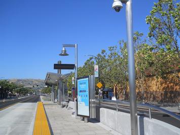
Photo Credit: Yngvadottir [CC BY-SA 4.0], via Wikimedia Commons


